
Visual Design II Projects
In my Visual Design II class, I worked on several projects during Spring 2025. Take a look at some of the designs I created this year!
Social Media Posts
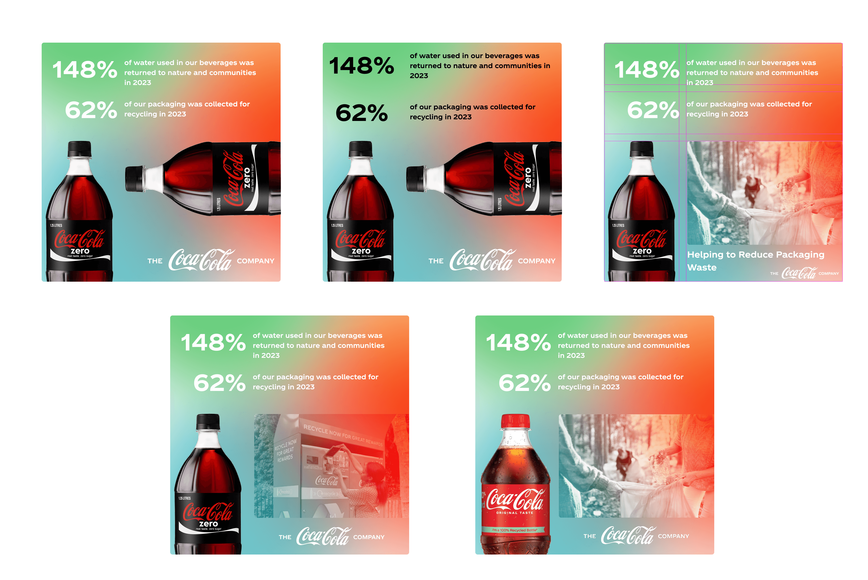
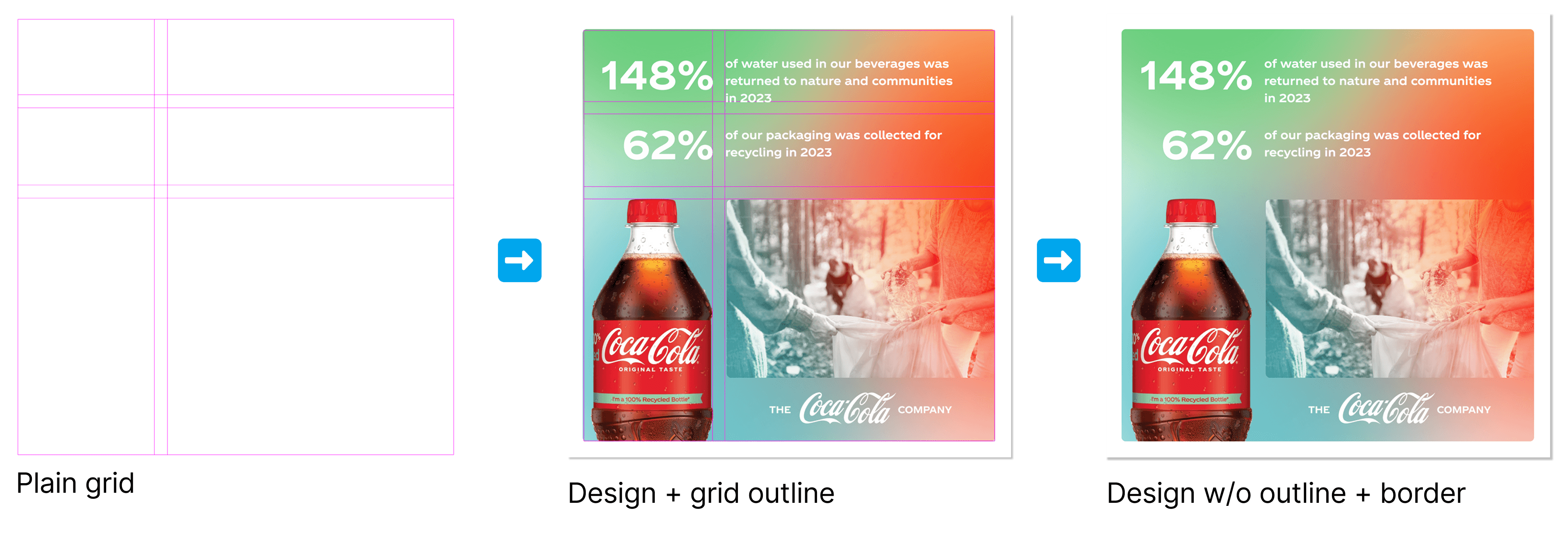
For this project, I had to create 3 social media posts for a brand. Each post had to reflect class concepts: symmetry/asymmetry, grid, and color relationships (like complementary and analogous colors). I chose Coca-Cola because I’m familiar with the brand as a Coca-Cola Scholar. To get started, I made a mood board and did some mind mapping in Figma to spark some ideas. I then created a theme for each post: sustainability, Coke Studio, and World Kindness Day.

My first post focused on sustainability. I included statistics from past Coca-Cola reports and used a split-complementary color scheme with asymmetrical balance.
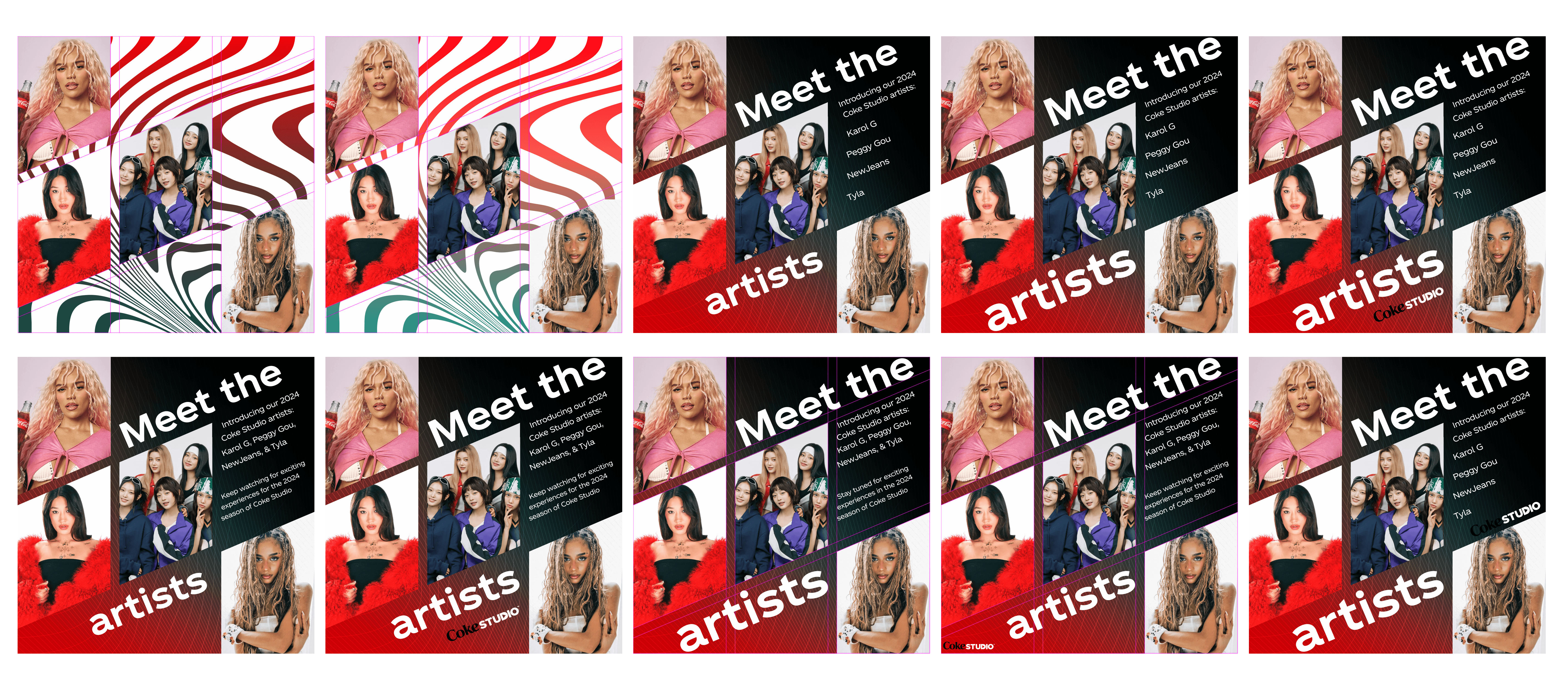
I was also inspired by Coke Studio, so I decided to focus my second post on that theme. Using a grid layout was very difficult since it was my first time working with one, so I went through lots and lots of iterations to get it right. This post uses a complementary theme and asymmetrical balance.

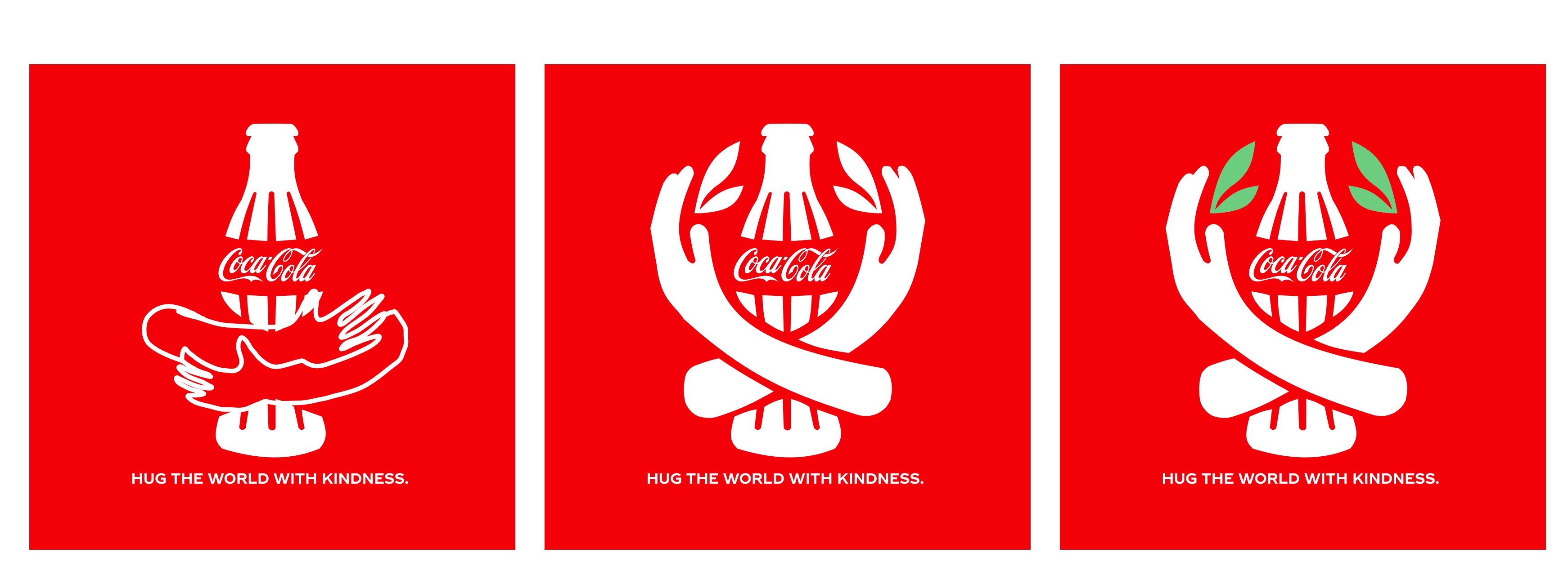
My last post was centered around World Kindness Day. I originally wanted to add hands hugging the bottle and really liked that idea, but the post needed to be symmetrical (to fit the assignment guidelines). So I adjusted the design by having the arms face upward and added green leaves to match the complementary color scheme. If I had more time, I would’ve liked to explore my original idea with fun scribbles and use a monochromatic color theme.
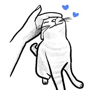
Instructions Graphic
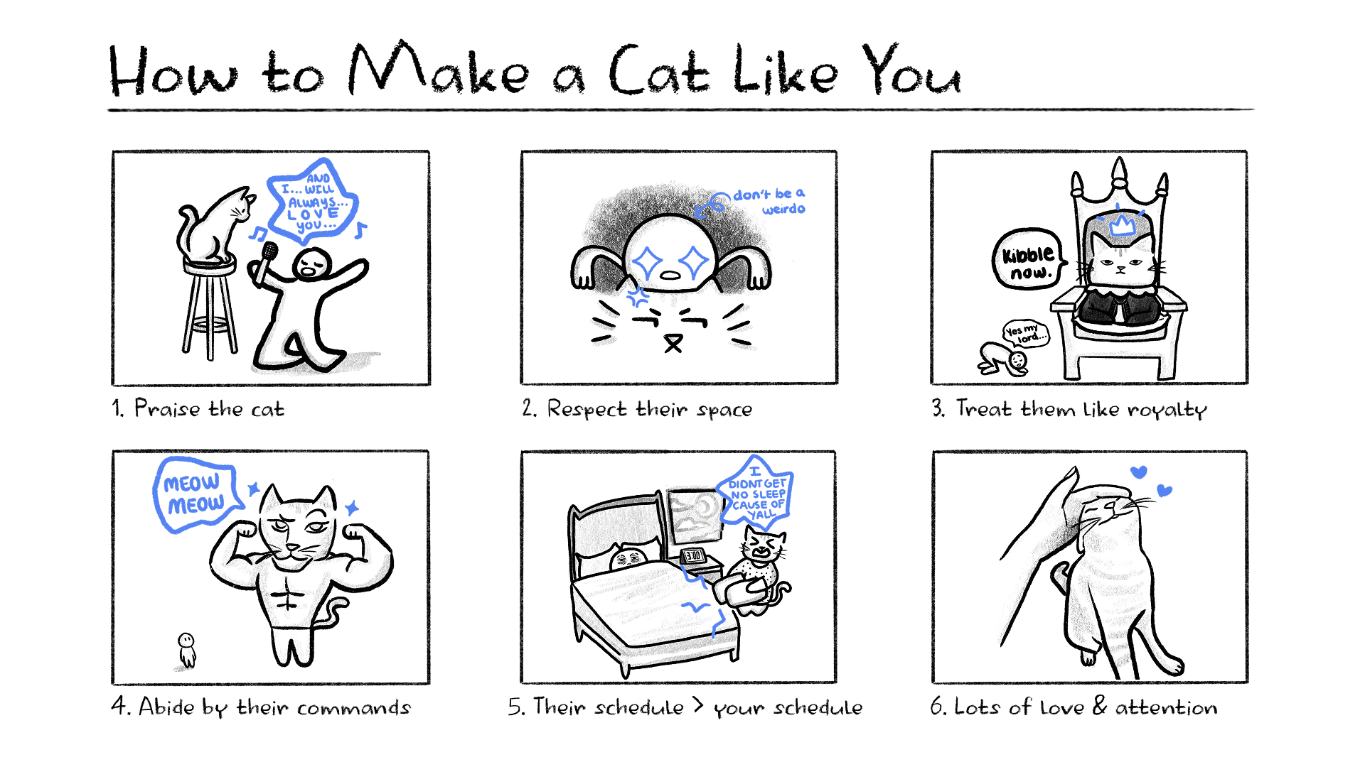
For this assignment, I had to create an instructional graphic for a task. The task needed to have at least four steps and include visual guidance, as well as incorporate class vocabulary: visual hierarchy, contrast, and a Gestalt principle. I started off by sketching ideas and instantly thought about cats. I wanted the instructions to have a comic-style look and be funny. I sketched different steps and came up with my final product below.
Accessibility Webpage
My last project could be about anything, so I decided to focus on accessibility since it wasn’t my strongest skill. I chose to create a webpage that takes users through three significant events that have positively impacted digital accessibility. Below is a presentation that shows my process for creating the page.
If I had more time, I would have liked to revise the introduction and conclusion, especially the parts that define accessibility, since they felt rushed. I originally planned to include only the three events, so the introduction and conclusion were added when I had extra time before the deadline. Click here to view the page.
Takeaways
Working with grids was both fun and challenging! I’ll definitely use them in future design projects to help organize content better. Leaning on my professor's feedback also helped me polish up my designs further. Overall, I really enjoyed creating projects that helped me grow my skills in interaction design, accessibility, and ideation.